Ideas made
tangible.
Design, craft, and a healthy
dose of curiosity.
 THE PORTFOLIO SYSTEM
PRSN / DESIGN SYSTEM / 01
The quiet layer around a world of ideas.
Two ways to see it. One shared language for everything I make.
01 / THE LIVING SYSTEM
Try a different feeling
Design, craft, and a healthy
dose of curiosity.

Aa 123
A space for design, craft, and possibility.
THE SIGNATURE DETAILS
Light that feels alive.
Glass you want to touch.
A flowing reflection, a single soft edge, and the original luminous glow. Reserved for moments you can touch.
Tap the avatar. Say hello.
A portrait avatar opens an acrylic contact card with a role and introduction, email, LinkedIn, a résumé, and a one-click copy action.
PRESENCE / SIX EXPLORATIONS
A pointer with a person attached.
Six ways to make it your own.
Sample collaborators · Visual mockups, not live presence.
Choose Preview motion to see them float.
Daylight: teal → cyan. After hours: cyan → live green.
Paul Parson · Design leadership. Hands-on craft.
--prsn-accent-gradientText accents use a separate contrast gradient. Daylight pairs deep teal #07505A with forest teal #145B50 so small text remains readable on light scene backgrounds. After hours retains cyan to live green.
--prsn-accent-text-gradient02 / FOUNDATIONS
Warm neutrals create depth.
Color earns its place.
An 8px rhythm, with 4px for the finer things.
A familiar shape at every scale.
FROM THE WORKBENCH
Five pigments, mixed to the system.
The same lime lives on the devices.
Obsidian and graphite ground After hours. Teal carries Daylight, cyan carries After hours, and live green marks the physical controls. The bottle labels are shorthand for the CSS tokens below.
03 / TYPOGRAPHY
DM Sans for UI and body. DM Serif Display for room welcomes.
Geist Mono for metadata.
Welcome to the Studio.
Room for possibility.
A practice in motion.
Little experiments. Lasting ideas.
A portfolio is a place to explore. Keep the words clear,
the controls familiar, and the work at the center.
SELECTED WORK / DESIGN · CRAFT · POSSIBILITY
--prsn-bg: #171717;04 / COMPONENTS
Real controls. Shared styles.
Go ahead, press something.
One primary action per moment. Always a clear next step.
Product and experience design, with people at the center.
Four independent games. Four little worlds to explore.
Design, craft, and the possibilities in between.
Color supports a message. It never carries it alone.
Reveal detail when it helps. Let the work lead, then make room for the story behind it.
Quick to acknowledge, soft to settle. Every interaction also works with reduced motion.
Every experiment starts somewhere.
ROOM CONTROLS
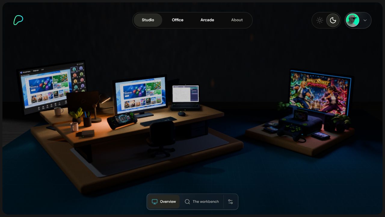
Selected views share a backplate and accent icon. Settings opens 12px above the toolbar. Gentle Motion follows you across the site, and Device tilt appears on compatible devices.
Workbench rows highlight physical objects on hover or keyboard focus. Office project rows use company icons. In portrait up to 800px wide, the shared header opens its navigation from a circular Menu button.
08 / IN THE ROOM
A quiet interface.
A scene with something to say.
01 / ANCHORKeep navigation in predictable places.
02 / CONTRASTUse scene-appropriate text color and reserve acrylic for controls and panels.
03 / RESTRAINTSave the color for the work itself.
09 / THE WAY WE MAKE
Quiet surfaces. Clear words. Playful details.
Useful motion. A generous amount of space.
# A shared language for the portfolio
design / Daylight & After hours
canvas / Ivory or charcoal
voice  / Curious. Clear. Human.

One system. Plenty of possibility.
Read DESIGN.md, then make something worth exploring.