Microsoft Store on Windows
Shortening the distance between “I want this” and “it’s installed.”
- My role
- Led Store design team for nearly six years, starting with the Windows 11 rebuild in 2021 and a core team of about five designers and researchers.
- Company
- Microsoft
- Period
- Starting in 2021
The Store now reaches more than 250 million monthly users. At that scale, a small improvement between browsing and installing adds up fast. Commerce leadership recognized our 2023 work for its business impact as well as its craft.
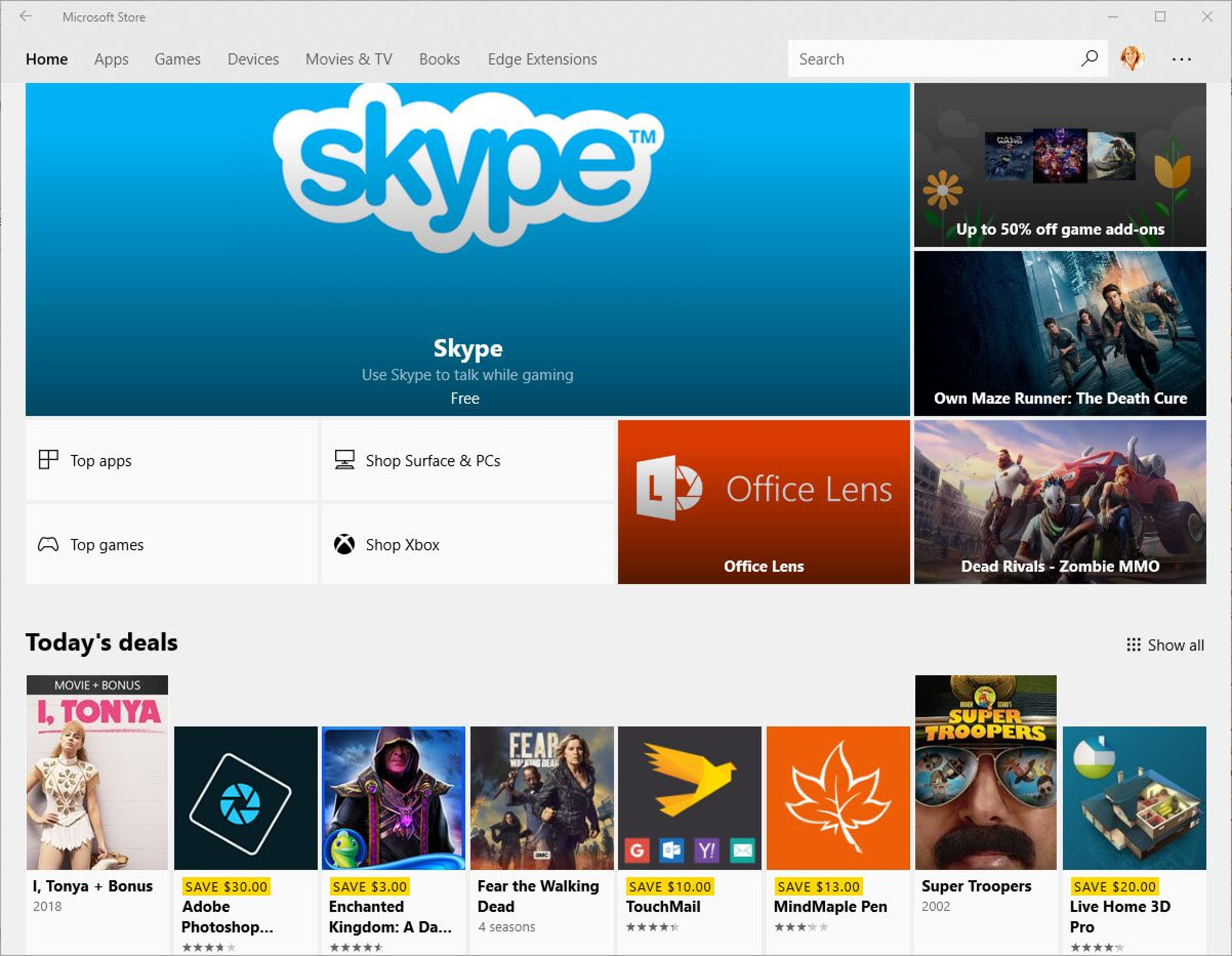
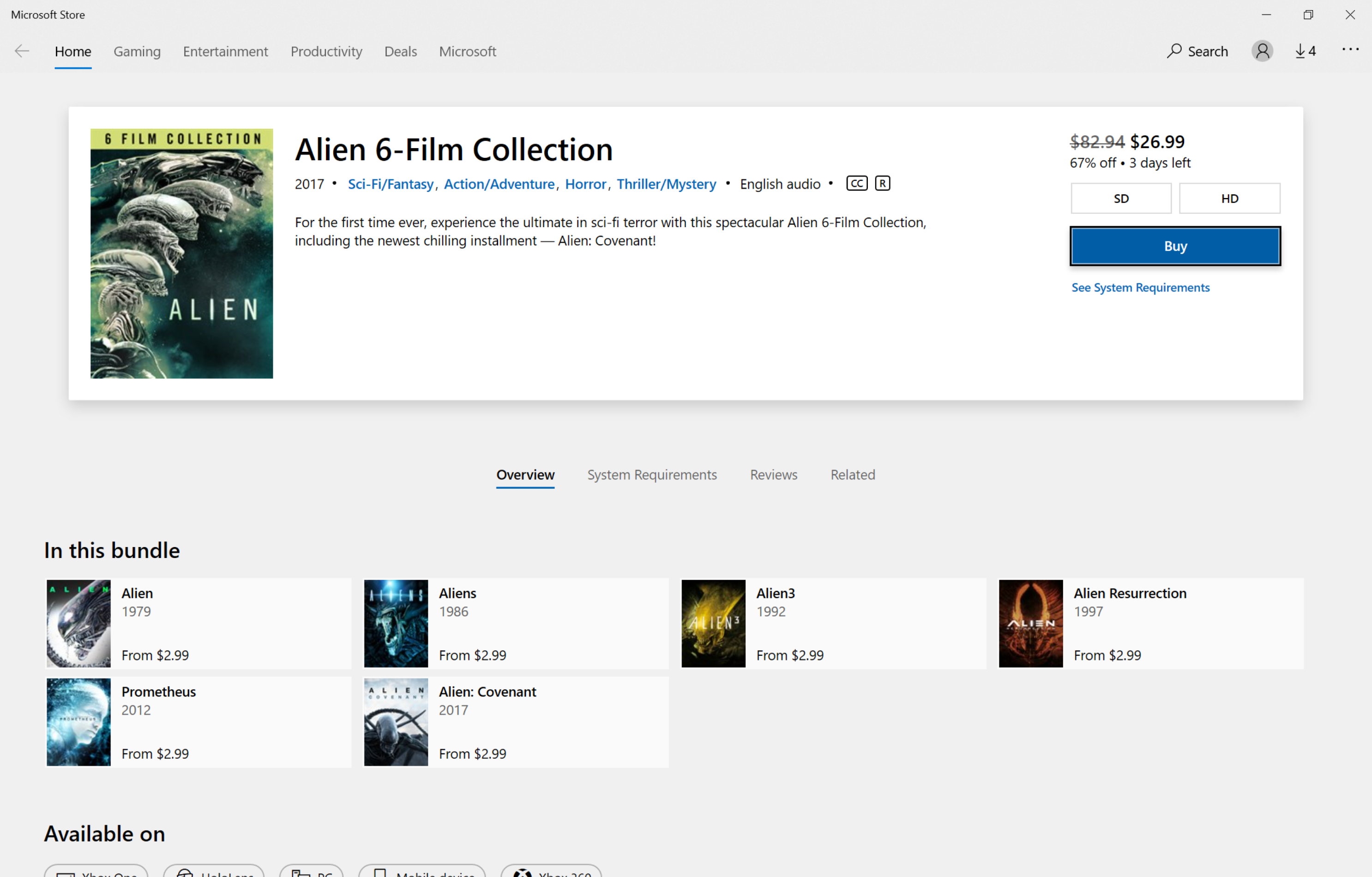
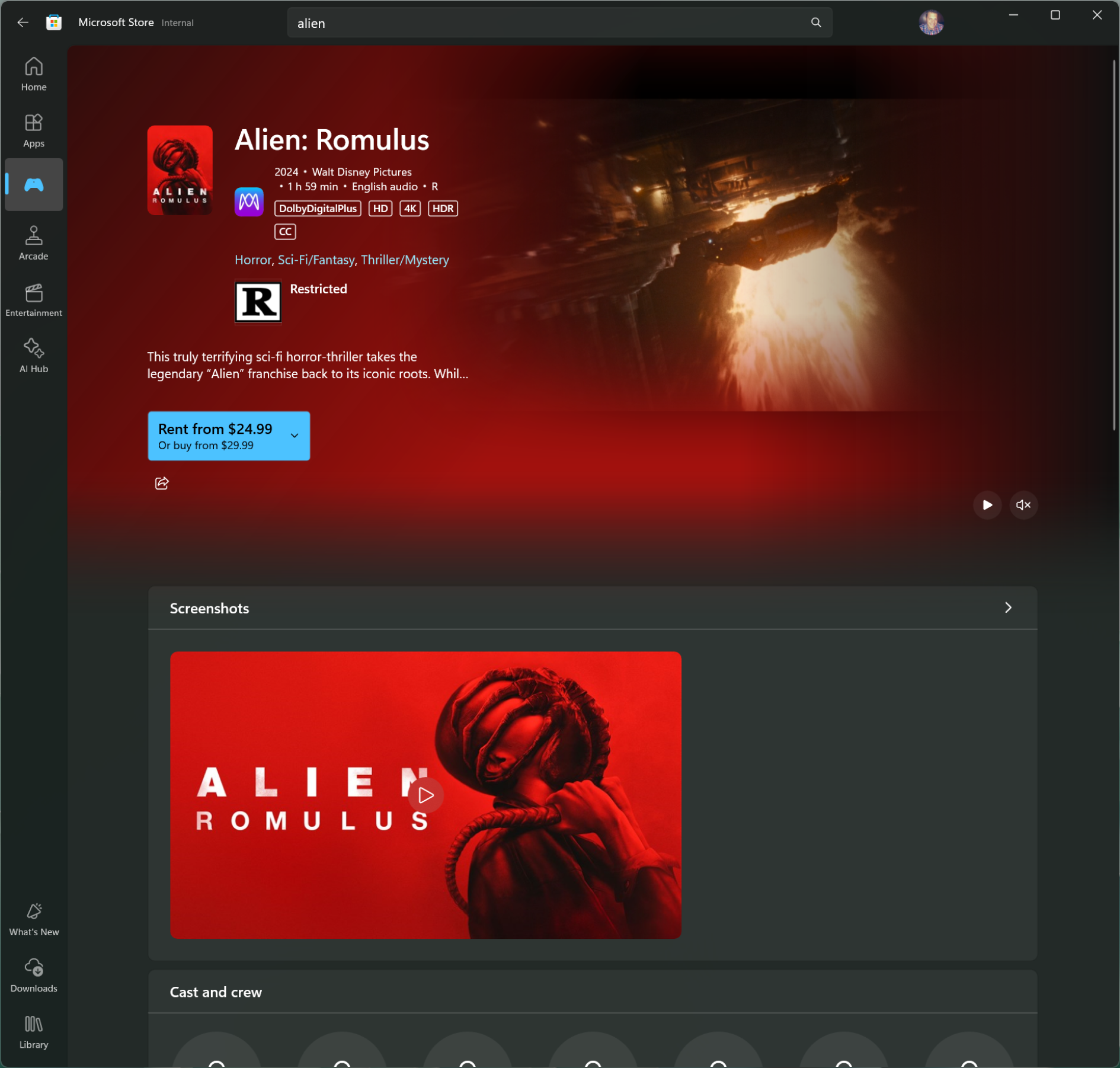
The 2021 rebuild gave the Store a new face for Windows 11. The gains that lasted came from changing how the user journey worked. My job was to help the team decide which parts of that journey were worth changing, and how to judge whether a change worked.
We ran more than 100 experiments with PM and engineering. Four levers stood out:
- Relevance over volume. Personalized, trend-driven content helped people find something worth installing sooner. The right ten items beat a hundred good ones.
- Fewer steps to yes. Installing right where people discover an app, including inline installs in Store Spotlight, beat sending them to a separate page.
- A reason to come back. Showing new seasons, events, and features inside apps and games turned the Store into a place to return to.
- Understanding intent. With engineering, search became more intent-aware. That matters most when people describe a need instead of naming an app.
Before we could change the Store, we had to say plainly what was wrong with it.
The existing research was out of date, so we audited the experience ourselves. The findings were tough, but gave us the evidence we needed to make the case for adding people and investigating the problems in more depth.
I could have softened the audit. Instead, I had the team build deep-dive assessments of each problem and share them broadly with leadership. Specific evidence settled what a general argument couldn’t, and those findings set our focus areas.
The work grew from the Windows app to Store on the web, Spotlight and Store Ads placements, and personalization. Each step changed how the journey worked, and none of the four levers above was merely a visual redesign. The visual redesign supported interaction and UX decisions.